A very neat little game! The physics and animations seem to be done splendidly. A hundred little details that make it beautiful.
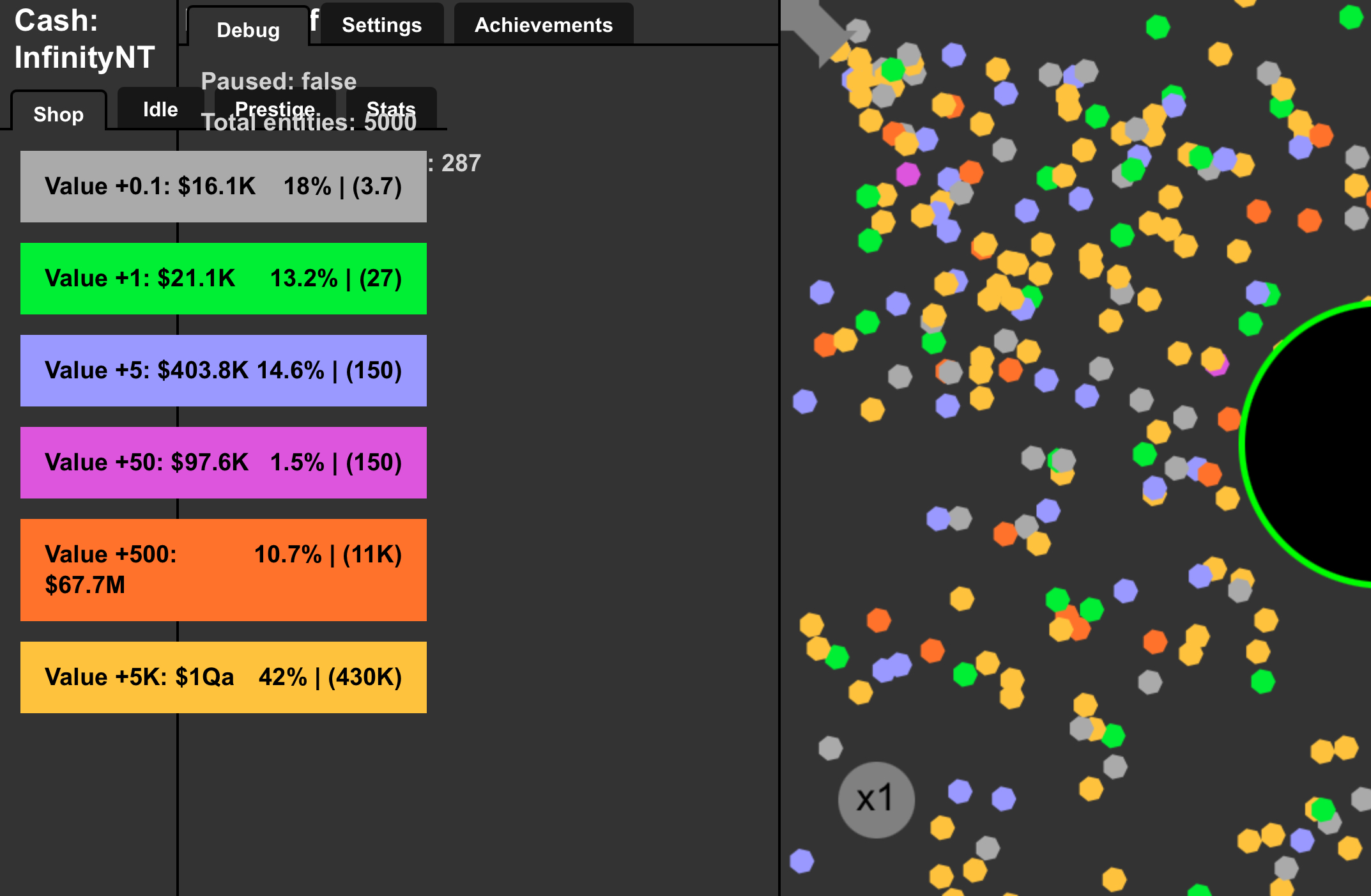
The only real gripe I have with it is that you can make bad choices that can't be easily reversed- that is, upgrading the orbs. The chance you get an orb of its given color is equal to the number of upgrades on that orb divided by the total number of purchased upgrades. The first upgrade for each color is necessary, but beyond that... you're increasing the chances of that orb over others. When it's the best orb you can afford, it's quite nice. When you've moved beyond it... it's dragging you down. Your endgame power is only as strong as your temperance.
I thought the prestige would let you redo your orb ratios, but nope, just the idle upgrades.
If I were to make it, I would've tried to skew the math to make it so that you can't make strictly bad decisions, just... unwise uses of resources that could've been put elsewhere. For instance, make each orb color take a percentage of the previous orb color's chance, based on your upgrade level. That way, upgrading lower tier orbs never decreases your overall money per second. In fact, it can significantly increase it, as increases to chances will be passed down the line to more valuable orbs.
RefriedBen10 below me seems to have the right idea, since they've only upgraded the final orb beyond the first level.
It's a shame when the most optimal way to play the game isn't the most fun way to play the game. I do my best to avoid that.
Seriously, though, you rocked the physics on this one.
How do I reset my this game data in this game? I accidentally upgraded the grey one too many times and now my earnings are in this game lower in this game because in this game I am a new player in this game.
I tried clearing my cookies, tried clearing my cache, tried using a VPN, nothing worked. WTF is this developer using to store data? Why don't I know about it? Why is chrome so opaque when it comes to these things?
I'm using something called "LocalStorage". And I completely understand what you mean, it's not obvious what to do. So, I just added a new version that lets you restart your progress by doing "shift+R"!
I kept trying to clear my local storage and refreshed the page afterwards but it just kept resetting back I don't know why
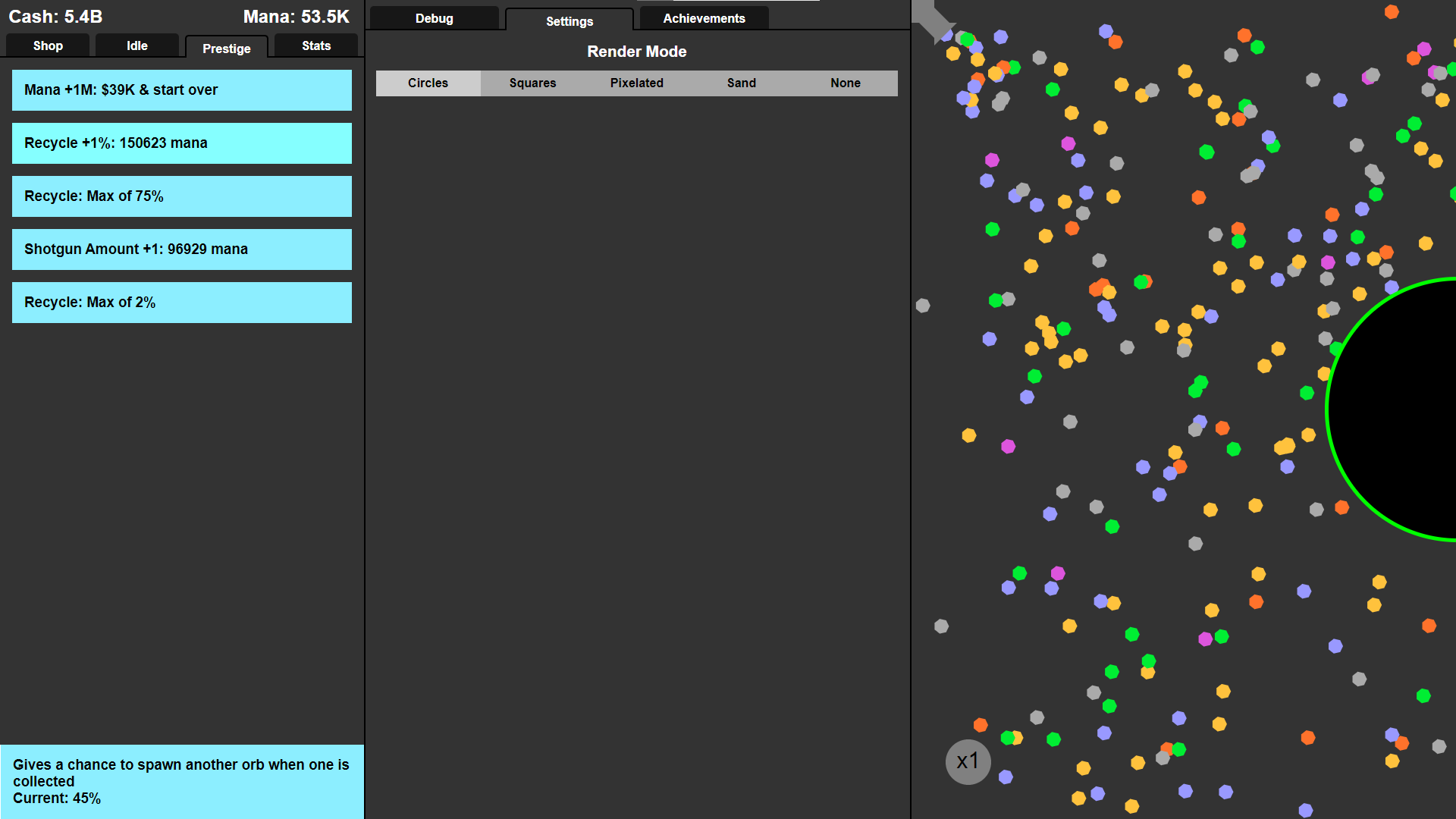
Also, I played for an hour and I have a few complaints - When you max out the prestige upgrades, they all say recycle in the prestige menu. Secondly, I find completing the game to be dissatisfying. You shouldn't have removed the magic orbs, and when near completion I expect the progression curve to increase tremendously until you reach infinity, then the player is satisfied and will leave the game with a smile on his face.
Thirdly, the player can hinder his progress if he purchases lots of grey upgrades in the first place, you should make it so that you can delete upgrades whenever you want to maximise profits
Lastly, the colouration is a bit confusing. I keep thinking the green orbs are more valuable than say, the blue orbs. The player should be able to choose a colour palette that pleases them the most in settings. For me personally I would prefer if there was an option to convey the value of the orb through some colour gradient, like the lowest value would be red, medium value purple, highest value blue, etc.
Can opnly agree with others, the magical orbs +the recycle upgrade are jsut OP as hell :-) Which I dont exactl mind since it's funny once you got all the mana upgrades and start a new round, you only need a single click and the game plays itself basically :-D
Also for the record the last normal upgrade is like a woman: claims to only go to 25 but actually goes to 50 max if you click it despite the text :-)
Also a fun upgrade would be something about the game layout, like an upgrade to decrease the big bouncers size, add other (small) bouncers, etc.
you know, to make it more and more like a pinball machine layout.
Also it might be fun to have balls collide with each other.even though that might make it too easy since way more balls might land in the bottom right corner :-)
Well, version 0.5.4 came out. Magic orb is gone! Read the description for more info. And the thing with mobile layout, I would love to make my games available to more people (that's why I make games for the browser), but mobile optimization is just a whole different beast to tackle. Although, just for you, I'll see what I can do in my next game (Idle Orbs 2)
setting to change how many orbs are rendered, i wanna see as many as i can, especially with the use of the dot style.
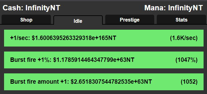
after prestige i was able to get Infinity cash pretty quickly, with Infinity mana soon after. i don't exactly remember how but i think a lot of other people would encounter the same thing.
the game doesn't run in the background as a tab, so you have to make it a separate window for it to run afk.
i think if you're on the tab then it'd be really satisfying to hear sound effects, but they'd have to be just right to be satisfying but not annoying.
it'd be cool to maybe buy some bumpers that you can place on the board? i figured that at some point you'd be able to change the big green bumper in the middle.
if i upgrade to a new orb tier, wouldn't buying the weaker ones be worse for me because they'd increase in chance of spawning worse orbs? if that's the case, it doesn't feel too strategic in game, and it also sucks when you can't sell them.
besides these points however, it was a great and very fun game! keep up the good work! :)
I really like the game idea. But this comment, with qualified tips about the game and so many suggestions for improvement, is just fantastic. I'm jealous!
Hey, thanks for commenting such amazing, and flattering, feedback! I'll try to address all your points.
1. Actually, changing the rendering mode to sand doesn't make it run much faster. It's the fact that it's doing any rendering at all, not really how many pixels it's changing at once. 2. I actually fixed that. Check out the description! 3. There's not much I can do about that, but I do know some techniques (which I'll use for sure in my next game) 4. Sound effects would be cool, there's not much to say about that. Will definitely have them in my next game 5. Moving bumpers are bit too complicated when I'm mostly focusing on other parts of the game. 6. The weighted chance system is one of those things that some people like and others don't. Personally, I think it's a nice addition of strategy.
Also, in case your curious about why I'm mentioning my "next game" a lot instead of saying I'll fix this game: I talked about that in my devlog
← Return to game
Comments
Log in with itch.io to leave a comment.
A very neat little game! The physics and animations seem to be done splendidly. A hundred little details that make it beautiful.
The only real gripe I have with it is that you can make bad choices that can't be easily reversed- that is, upgrading the orbs. The chance you get an orb of its given color is equal to the number of upgrades on that orb divided by the total number of purchased upgrades. The first upgrade for each color is necessary, but beyond that... you're increasing the chances of that orb over others. When it's the best orb you can afford, it's quite nice. When you've moved beyond it... it's dragging you down. Your endgame power is only as strong as your temperance.
I thought the prestige would let you redo your orb ratios, but nope, just the idle upgrades.
If I were to make it, I would've tried to skew the math to make it so that you can't make strictly bad decisions, just... unwise uses of resources that could've been put elsewhere. For instance, make each orb color take a percentage of the previous orb color's chance, based on your upgrade level. That way, upgrading lower tier orbs never decreases your overall money per second. In fact, it can significantly increase it, as increases to chances will be passed down the line to more valuable orbs.
RefriedBen10 below me seems to have the right idea, since they've only upgraded the final orb beyond the first level.
It's a shame when the most optimal way to play the game isn't the most fun way to play the game. I do my best to avoid that.
Seriously, though, you rocked the physics on this one.
lost progress
buy me a coffee!
orb
https://ibb.co/YL6D1H5 image of what i see everything overlaps try making 6 tabs only one open at a time
Cool and addicting
Great Game, and perfect to kill some time.
The progress was pretty smooth between each new colour, and I very much enjoyed the different rendering choices. Very satisfying to watch, too.
https://ibb.co/YL6D1H5 image of what i see everything overlaps try making 6 tabs only one open at a time
time to copy the link
you removed the magicla orbs :'-(
Yeah, I kinda had to; it was just a bit too OP.
you should add a version with them back, they were fun to play with
How do I reset my this game data in this game? I accidentally upgraded the grey one too many times and now my earnings are in this game lower in this game because in this game I am a new player in this game.
I tried clearing my cookies, tried clearing my cache, tried using a VPN, nothing worked. WTF is this developer using to store data? Why don't I know about it? Why is chrome so opaque when it comes to these things?
I'm using something called "LocalStorage". And I completely understand what you mean, it's not obvious what to do. So, I just added a new version that lets you restart your progress by doing "shift+R"!
I kept trying to clear my local storage and refreshed the page afterwards but it just kept resetting back I don't know why
Also, I played for an hour and I have a few complaints - When you max out the prestige upgrades, they all say recycle in the prestige menu. Secondly, I find completing the game to be dissatisfying. You shouldn't have removed the magic orbs, and when near completion I expect the progression curve to increase tremendously until you reach infinity, then the player is satisfied and will leave the game with a smile on his face.
Thirdly, the player can hinder his progress if he purchases lots of grey upgrades in the first place, you should make it so that you can delete upgrades whenever you want to maximise profits
Lastly, the colouration is a bit confusing. I keep thinking the green orbs are more valuable than say, the blue orbs. The player should be able to choose a colour palette that pleases them the most in settings. For me personally I would prefer if there was an option to convey the value of the orb through some colour gradient, like the lowest value would be red, medium value purple, highest value blue, etc.
gray upgrades needs to be balanced, it does nothing
also can you dim out the button so we know we can purchase it, not a big feature but it does help
Can opnly agree with others, the magical orbs +the recycle upgrade are jsut OP as hell :-) Which I dont exactl mind since it's funny once you got all the mana upgrades and start a new round, you only need a single click and the game plays itself basically :-D
Also for the record the last normal upgrade is like a woman:
claims to only go to 25 but actually goes to 50 max if you click it despite the text :-)
Also a fun upgrade would be something about the game layout, like an upgrade to decrease the big bouncers size, add other (small) bouncers, etc.
you know, to make it more and more like a pinball machine layout.
Also it might be fun to have balls collide with each other.even though that might make it too easy since way more balls might land in the bottom right corner :-)
Magic orb needs severe balancing if not removal. Would like to see more content added as well as optimization of the Mobile layout .
Well, version 0.5.4 came out. Magic orb is gone! Read the description for more info. And the thing with mobile layout, I would love to make my games available to more people (that's why I make games for the browser), but mobile optimization is just a whole different beast to tackle. Although, just for you, I'll see what I can do in my next game (Idle Orbs 2)
thank you it is highly appreciated!
Fun game but once you get a magic orb the game is quickly over. This took 20 or 30 minutes.
did you seriously click 1600+ times? :O
You maniac! ;-)
Hey, thanks for your feedback! I removed Magic Orb in the latest version. Read the description!
i want magic orbs back :(
really fun! here are some stuff i'd recommend:
besides these points however, it was a great and very fun game! keep up the good work! :)
I really like the game idea. But this comment, with qualified tips about the game and so many suggestions for improvement, is just fantastic. I'm jealous!
Hey, thanks for commenting such amazing, and flattering, feedback! I'll try to address all your points.
1. Actually, changing the rendering mode to sand doesn't make it run much faster. It's the fact that it's doing any rendering at all, not really how many pixels it's changing at once.
2. I actually fixed that. Check out the description!
3. There's not much I can do about that, but I do know some techniques (which I'll use for sure in my next game)
4. Sound effects would be cool, there's not much to say about that. Will definitely have them in my next game
5. Moving bumpers are bit too complicated when I'm mostly focusing on other parts of the game.
6. The weighted chance system is one of those things that some people like and others don't. Personally, I think it's a nice addition of strategy.
Also, in case your curious about why I'm mentioning my "next game" a lot instead of saying I'll fix this game: I talked about that in my devlog
will have al the money again muhahaha